Release Version 21.07.1
Date: 1 July 2021
Note that it can take 24 hours or so for the new version to become available on the Apple and Google Play app stores
Navigation Sidebar
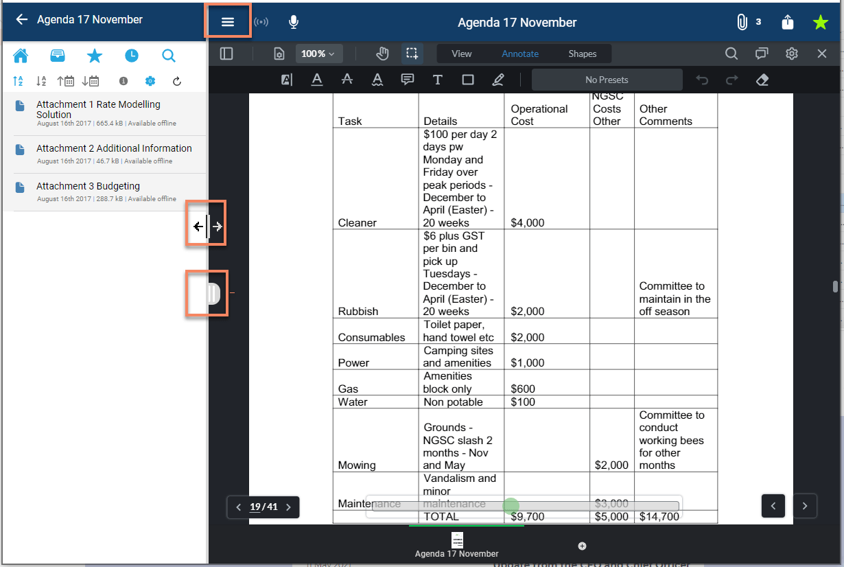
The navigation sidebar will now be "pinned" when displayed on larger devices. A large device is defined as a device with a screen viewport larger than 992px i.e. most laptops, desktop computers and iPads in landscape mode. The sidebar will continue to operate as it has previously done on devices with smaller screens i.e. phones and iPads in portrait mode.
This change will make it easier to navigate between documents, particularly attachments, without needing to display the sidebar prior to being able to select a new document.
The following features apply to devices with a larger screen viewport:
- The sidebar will "push in" and sit on the left hand side of the screen. It won't overlay the screen, nor will it disappear when an item is selected or a another part of the screen is tapped/clicked.
- The sidebar can be shown or hidden by tapping the menu button in the top left of the screen.
- An alternative way of showing or hiding the sidebar is to tap/click and then drag in the new tab that will appear in the centre left of the screen.
- The sidebar can resized to your preferred width by tapping/clicking and then dragging the new tab OR the divider between the sidebar and the document viewer.
- When the sidebar is shown using the menu button at the top left of the screen, it will display at the last width it was resized to. If no resizing has occurred the default width is 300px.
- The maximum width that the sidebar can be expanded to is 500px.
- If the sidebar is resized to less than 100px, it will automatically snap shut and be reset to its default width of 300px.

We also fixed a problem that prevented selecting of items in the navigation sidebar with the Apple pencil.